Netflix Watch Party
Project Scope: Presented with a speculative scenario in the General Assembly user experience design program, Netflix is struggling to stay atop the pack of streaming services and is looking to explore options to integrate innovative social features into their viewing platform to boost user engagement.
My Role: UX Researcher / UX&UI Designer
Project Duration: 2/28/22 - 3/11/22
My Team: Jared Horman, Yaquetta McDowell, Katie Kim, Emilie Chen, Mason Materna
Tools: Figma, Maze, Google Suite, Microsoft Excel, Zoom, Slack, Photoshop, Asana
Methodologies: Surveys, User Interviews, Affinity Mapping, Persona Development, Journey Mapping, Competitive & Comparative Analysis, Heuristic Evaluation, Design Studio, Sketching, Wireframming, Rapid Prototyping, Usability Testing, Iterative Testing
Project Index
Research & Synthesis
01 Research
Our team was investigating how we could integrate social capabilities into Netflix’s already established and flourishing streaming platform. To start this process we needed to understand who our users were, and what their main pain points were in regards to the social aspects of streaming services that were already available.
To begin learning about our users, we wanted to conduct preliminary generative research to find out how users were currently using streaming services, what the primary demographic of users engaging with these services was, and pinpoint the areas users felt something was missing so we could find a way to bridge that gap.
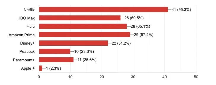
Users Streaming Service Usage
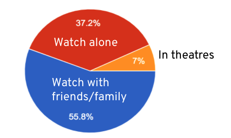
Users Viewing Environment
To learn about users of streaming services current viewing patterns and behaviors, we sent out a generative survey and received responses from 43 users and further interviewed 6 of these users to define key patterns of users within our target demographic.
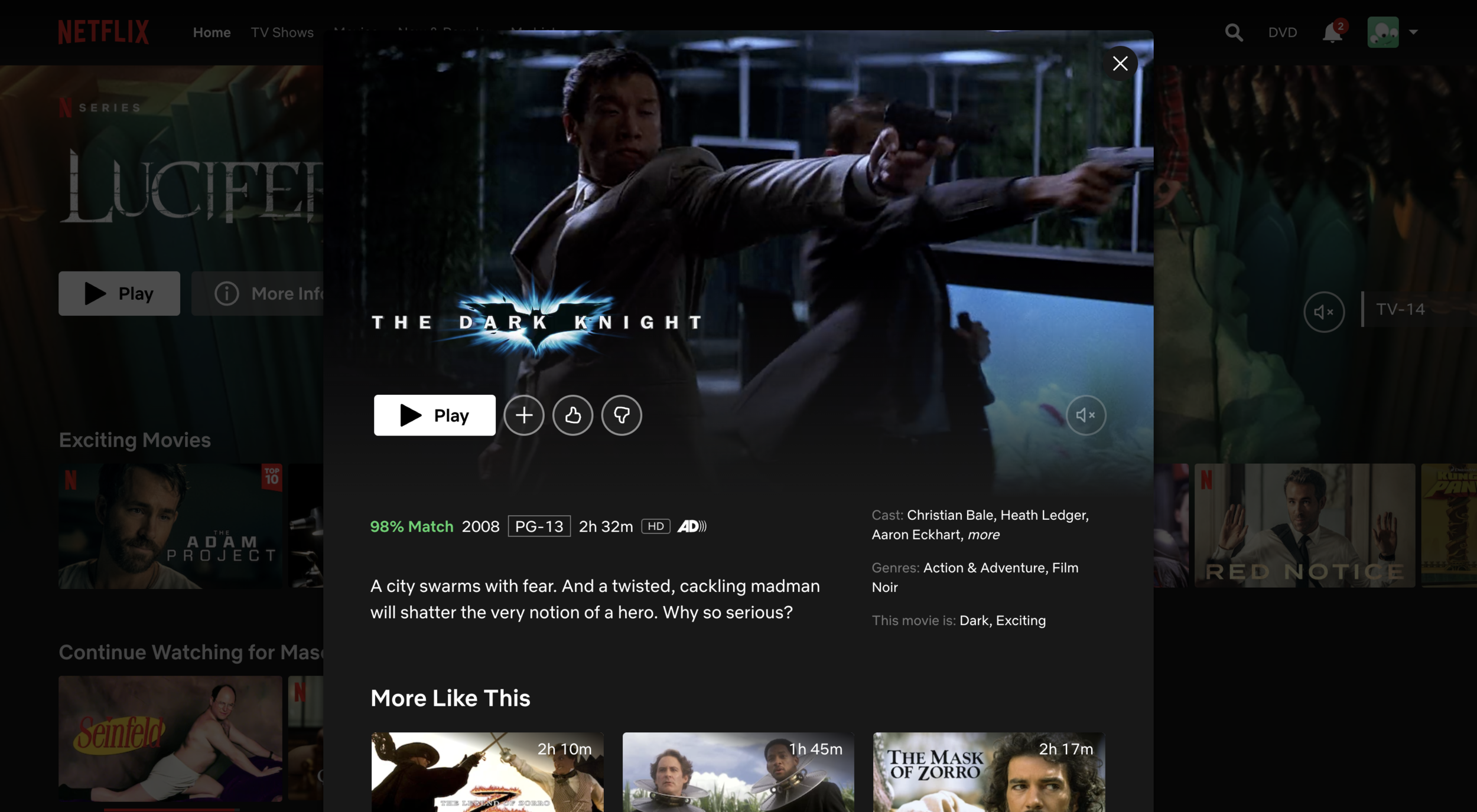
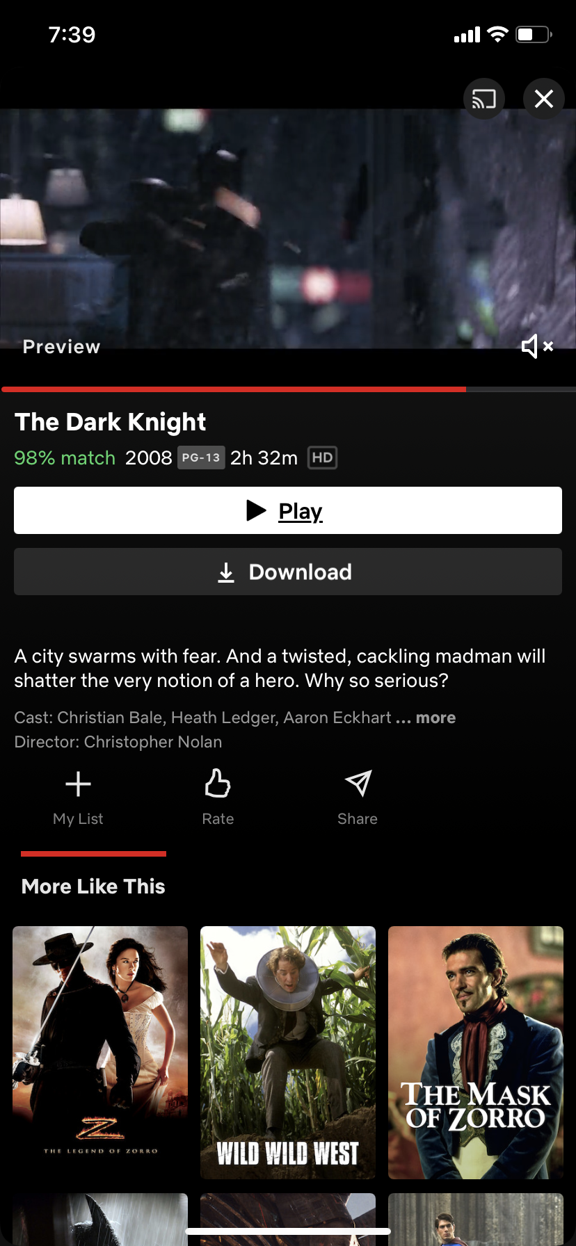
Paired with conducting user research, to help us better comprehensively understand Netflix and the usability of their current platforms we conducted a heuristic evaluation based off of the list of usability heuristics created by the Neilsen Norman Group, and analyzed the way in which Netflix’s mobile and desktop platforms were curated to be sure to both identify and respect those design differences between platforms while moving forward with our designs.
Desktop media preview screen
Mobile media preview screen
To garner an understanding of where Netflix was situated amongst the competition in regards to their UI and platform capabilities, my team and I also conducted a competitive and comparative analysis in the form of a feature inventory to identify features that Netflix didn’t have that other leaders amongst the industry offered, to help inform our further design decisions.
Competitor & Comparator Feature Inventory
Through researching the competition and usability of the current platform we identified that Netflix as a platform had very few minor usability issues, and further concluded that our work would not be centered around reworking the existing user interface, rather seeing how to integrate new features and designs into the existing platform to enhance the users freedom on the platform and overall experience.
02 Synthesis of Research
After identifying 6 users from our generative survey to conduct user interviews with and interviewing them about their current streaming service experience, we then affinity mapped the results of these interviews to identify the key insights and trends from our users.
Key Takeaways
“I want to connect with friends and family over the show/movie”
“I like to see my company’s reactions to the show/movie”
“I want everything contained on the same platform”
“I enjoy seeing and hearing my friends while watching together”
Using the key interview insights along with our previous research data, we carefully created a user persona and user journey map to humanize our data and allow us to better design with our archetypical user and their common pain points in mind.
Meet Matty
With a deeper understanding of the users and the landscape of the streaming industry from our research, we consolidated our data into a persona representative of the target market. Matty’s pain points are centered on:
Needing to use a third party for virtual watch with groups
No way to share his commentary/ thoughts and vice versa
The inability to share reactions and emotions in real time
A Day In Matty’s Life
Matty loves sharing his thoughts and emotions on his most recently watched media
But without people to do this with in person, Matty feels lonely and wishes he had opportunities for these social bonding interactions.
Using Matty and his day to day struggles we developed our problem statement to pinpoint what our key users struggle with
Matty’s Problem:
Matty is a new college student who used to connect over Netflix with his sister, but now that he’s on his own, he’s been struggling to build a new community and needs to find a way to build relationships through shared interests.
We used these key findings to fuel our design thinking, of how could we create ways for users to be able to bond and connect with one another and share their love of tv shows and movies all within the Netflix Platform?
Ideation & Design
03 First Designs
To begin the design phase, we engaged in a design studio to brainstorm ideas of what each of us envisioned the solution to be, we then discussed what similarities we saw across the sketches, to then settle as a team on a list of Key Features and an Ideal Path to design.
Feature List
Hover/preview card with “watch party” icon
Same design style for the “Live” home page
Friends & friends status
Social media buttons / connectivity
Post-viewing discussion space
Hero image preview
Once the features to integrate into our design and the flows we wanted to design for had been clearly identified, we moved to mocking up mid-fidelity wireframes to visualize how these features could fit into Netflix’s platform.
While integrating these key features identified by our users into designs, we made sure to keep in mind Netflix’s established and well-know brand, and thus aimed to integrate these features into the fabric of the already existing platform and maintain the feel of “Netflix” in our newly designed features.
Mid-Fidelity Wireframe Mockups
With our research data showing that a majority of our target users use their desktop or laptop screen primarily for watching Netflix, we decided to design our mid-fidelity wireframes for desktop first, and then move to the mobile designs.
Desktop Wireframes
Key Features
Holding screen for hosting users before starting to watch
Capability to invite friends to join
Key Features
Camera and audio connectivity while viewing
Chat features available
Emote reactions
Key Features
Camera and audio connectivity in post viewing lobby
Continued chat connectivity
Mobile Wireframes
After designing for the desktop, we moved to mobile, where we wanted to ensure design continuity across the two platforms while integrating our new features now condensed to fit within the confines of the mobile frames.
Key Features
A “Watch Party” icon added into the row of available show/movie features
A holding screen/lobby to invite and have friends join before starting to watch
Key Features
Chat feature for users to freely communicate with one another while watching
Camera and audio connectivity so users are able to communicate “face to face” while watching
Emote reactions available to convey quick real-time reactions
Key Features
Camera and audio connectivity continued to after viewing to allow further discussion after the episode/movie ends
Continued Chat functionality in the post viewing lobby as well
Able to continue watching as a group when ready
04 Usability Testing Results
After creating and linking together the interactions for the mid-fidelity wireframes for both mobile and desktop versions together, we conducted usability tests to see how users experienced our designs, and garner helpful data on where users ran into problems and ways we could streamline and optimize the user flow to complete the tasks.
The users we ran usability tests with were asked to accomplish two tasks:
Invite a friend to watch a show episode through the closed party function
Join a live event, and invite a friend to that event
4/5
Users noted there were too many clicks/steps needed to accomplish the simple task of adding a friend to the party.
5/5
Users did not recognize the “live” button as a navigational item and thus did not use it.
3/5
Users noted that the preview screen before joining a “live" event was unnecessary and added an extra step in the process.
Iterating the Designs
All users tested enjoyed the friends feature, how can we further integrate this feature into our designed interactions?
How can we minimize the number of clicks needed and streamline the functions?
Redesign the “Live” home page to be noticeably different?
Rework the “Live” navigation bar to maintain design continuity across the platform?
Using the data garnered from our usability tests, as a team we discussed how to reiterate the mobile and desktop designs to better cater to what our users wanted and to make sure to streamline the process wherever feasible.
Final Designs
05 Final Prototypes
By iterating our mid-fidelity wireframes based on the data produced by our usability testing results and data we collected, we redesigned and brought to life our final high-fidelity prototypes for Netflix’s Watch Party on both mobile and desktop platforms.
Next Steps
Usability Test Round 2 Results
After running 5 more usability tests on our final designs, our users were able to accomplish their tasks with little to no issue, but noted some aesthetic and visual things they felt would improve the overall usability of the platform.
While the project window had ended and we didn’t have time to reiterate our designs and implement changes, we noted the users feedback and speculated where we might move next if time permitted.
Our users noted that the watch party icon blends into the existing site icons, and we should consider a color change or enlargement to make it more noticeable
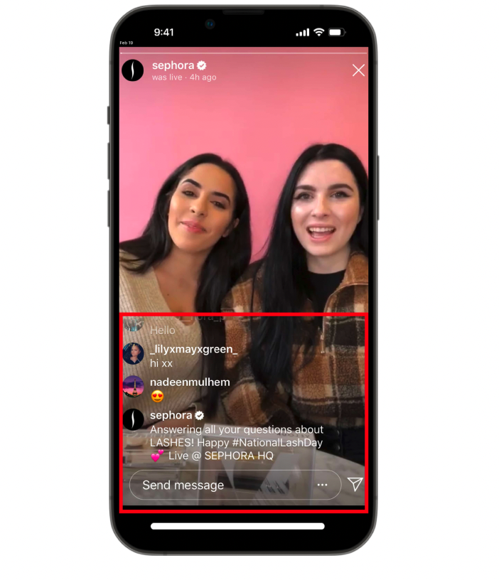
Potentially making the comment section similar to Instagram live how they populate from the bottom up and gradually disappear
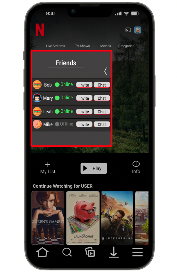
The friends pop out modal should have an option to invite straight from there and not have to go through the show card
06 Retrospective
Overview
By doing such strong and thorough user research in the early stages of this project, I felt confident in making decisions and suggestions based off of our users needs rather than my own feelings or preconceived notions, and I felt that this built a strong base to work off of for the remainder of the project. In usability testing, it was disheartening to watch the users struggle through our designs that we felt were quite intuitive, but after a quick reframing and understanding how helpful these user tests are and emotionally detaching from our designs, I felt the usability tests were very impactful and immensely helpful in creating our final designs. Overall I felt that this project sprint, though speculative, was highly successful. I felt in the two week duration I was able to gain valuable practice in a number of UX research methods as well as design practices such as sketching, wire-framing, and prototyping. I also feel that critically analyzing my work through this project and identifying areas that weren’t as strong as they could have been will help me be more cognizant of this moving forward and ultimately improve my UX process moving forward.
Highlights
One area I felt I excelled in during this project was rapid prototyping of our designs. While working to bring the mid-fidelity version to fruition as soon as possible to move forward with usability testing, I felt I was able to work quickly while still adhering to good design principles and practices and designing strictly off the key features list agreed upon, and not integrating my own ideas without the agreement of the whole team first.
Struggles
One spot I struggled during the duration of this project was time management, I consider myself a bit of a perfectionist and was getting too bogged down on small details of the designs. A key way I combatted this was by practicing time-boxing, by utilizing this method I was forced to focus on the primary functions and designs rather than smaller aesthetic and design features. By time-boxing I was able to expedite the process of bringing together mid-fidelity wireframes for usability testing, rewarding us with more time to reiterate our designs and allow perfectionism to shine on the high-fidelity prototypes.
